Chapter 9: Bayesian Predictive Analysis
Chapter09.RmdSection 9.1: From Bayesian Posterior to Bayesian Predictive Inference
Example 9.1: Road safety data - single predictions
We load the data and extract the observations for the senior people in Linz. We then plot the pdf and cdf for the predictive distribution which corresponds under the flat prior to
data("accidents", package = "BayesianLearningCode")
y <- accidents[, "seniors_accidents"]
(aN <- sum(y) + 1)
#> [1] 1009
(bN <- length(y))
#> [1] 192
mu <- aN / bN
yf <- 0:20
plot(yf, dnbinom(yf, size = aN, mu = mu),
     type = "h", xlab = bquote(y[f]), ylab = "", lwd = 2)
plot(yf, pnbinom(yf, size = aN, mu = mu),
     type = "h", xlab = bquote(y[f]), ylab = "", lwd = 2)
probs <- c(0.025, 0.975)
abline(h = probs, lty = 3)
mtext(probs, side = 2, at = probs, adj = c(0, 1), cex = .8, col = "dimgrey")
Example 9.2: CHF exchange rate data - single predictions
We load the data and then plot the pdf and cdf for the predictive distribution which corresponds under the improper prior to
library("BayesianLearningCode")
data("exrates", package = "stochvol")
y <- 100 * diff(log(exrates$USD / exrates$CHF))
ybar <- mean(y)
N <- length(y)
b0 <- 0
N0 <- 0
c0 <- -1/2
C0 <- 0
BN <- 1 / (N + N0)
bN <- BN * (N * ybar + N0 * b0)
cN <- c0 + N/2
CN <- C0 + .5 * sum((y - ybar)^2) + N0 * N / (2 * (N0 + N)) * (b0 - ybar)^2
x <- seq(-3, 3, length.out = 200)
scale <- sqrt(CN / cN * (BN + 1))
plot(x, dstudt(x, location = bN, scale = scale, df = 2 * cN),
     type = "l", xlab = bquote(y[f]), ylab = "", lwd = 1.5)
plot(x, pstudt(x, location = bN, scale = scale, df = 2 * cN),
     type = "l", xlab = bquote(y[f]), ylab = "", lwd = 1.5)
probs <- c(0.025, 0.975)
abline(h = probs, lty = 3)
mtext(probs, side = 2, at = probs, adj = c(0, 1), cex = .8, col = "dimgrey")
We inspect the parameters of the Student-t distribution.
Example 9.3: CHF exchange rate data - plug-in versus Bayesian forecasting
To compare with a method that ignores parameter uncertainty, we now plot the posterior predictive alongside the “classical” forecasting distribution for varying .
Ns <- c(5, 10, 30, N)

for (i in seq_along(Ns)) {
  N <- Ns[i]
  yshort <- y[1:N]
  ybar <- mean(yshort)
  BN <- 1 / (N + N0)
  bN <- BN * (N * ybar + N0 * b0)
  cN <- c0 + N/2
  CN <- C0 + .5 * sum((yshort - ybar)^2) + N0 * N / (2 * (N0 + N)) * (b0 - ybar)^2
  scale <- sqrt(CN / cN * (BN + 1))
  plot(x, dnorm(x, ybar, sd(yshort)), lty = 2, type = "l", lwd = 1.5,
       xlab = bquote(y[f]), ylab = "", main = paste("N =", N))
  lines(x, dstudt(x, location = bN, scale = scale, df = 2 * cN), lwd = 1.5)
}
Example 9.4: Road safety data - posterior predictive credible interval
We verify that a 95% posterior predictive interval is given by [1, 9] using the cdf and compute the effective coverage.
Example 9.5: CHF exchange rate data - posterior predictive credible interval
We determine the 95% posterior predictive interval using the quantile function.
We now work out the effective coverage of the naive interval which ignores parameter uncertainty.
coverage <- rep(NA_real_, length(Ns))
names(coverage) <- Ns
for (i in seq_along(Ns)) {
  N <- Ns[i]
  yshort <- y[1:N]
  quants <- qnorm(probs, mean(yshort), sd(yshort))
  coverage[i] <- diff(pstudt(quants, mean(yshort), sd(yshort) * sqrt(1 + 1/N),
                             2 * (c0 + N/2)))
}
knitr::kable(t(round(coverage, 4)))| 5 | 10 | 30 | 3139 |
|---|---|---|---|
| 0.8519 | 0.9055 | 0.9363 | 0.9499 |
Section 9.3: A Sampling-Based Approach to Prediction
Example 9.8: CHF exchange rate data - sampling-based prediction
We proceed exactly as in Chapter 4. For the Gaussian distribution, the posterior of is inverse gamma, and we can easily generate iid draws.
For the Student- model, we can use inverse transform sampling. First, we draw uniformly from the interval spanned by 0 and the maximum of the non-normalized cumulative posterior. Then, for each draw, we find the interval of our pointwise cdf approximation of the posterior, and interpolate linearly between the interval boundaries.
# We need the nonnormalized cumulative posterior distribution
post_nonnormalized_nonvec <- function(sigma2, y, nu, log = FALSE) {
  logdens <- -length(y) / 2 * log(sigma2) -
    (nu + 1) / 2 * sum(log(1 + y^2 / (nu * sigma2))) - log(sigma2)
  if (log) logdens else exp(logdens)
}
post_nonnormalized <- Vectorize(post_nonnormalized_nonvec, "sigma2")

# Now, we compute the pdf and cdf on a reasonably chosen grid
nu <- 7
sigma2 <- seq(0.25, 0.45, length.out = 3000)
pdf_u <- post_nonnormalized(sigma2, y = y, nu = nu)
pdf_u <- pdf_u / max(pdf_u)
cdf_u <- cumsum(pdf_u) / sum(pdf_u)

# Now we can perform inverse transpose sampling
unifdraws <- runif(ndraws, 0, cdf_u[length(cdf_u)])
leftind <- findInterval(unifdraws, cdf_u)
rightind <- leftind + 1L
distprop <- (unifdraws - cdf_u[leftind]) / (cdf_u[rightind] - cdf_u[leftind])
sigma2draws_t <- sigma2[leftind] + distprop *
  (sigma2[rightind] - sigma2[leftind])
Next, we simulate draws from the posterior predictive.
yf_normal <- rnorm(ndraws, 0, sqrt(sigma2draws_normal))
yf_t <- rstudt(ndraws, 0, sqrt(sigma2draws_t), 7)
Now we can compute their empirical quantiles, and those of the data.
thesequants <- c(0.01, 0.05, 0.25, 0.4, 0.5, 0.6, 0.75, 0.95, 0.99)
q_normal <- quantile(yf_normal, thesequants)
q_t <- quantile(yf_t, thesequants)
q_y <- quantile(y, thesequants)

knitr::kable(round(t(cbind("Data" = q_y, "Student t" = q_t,
"Gaussian" = q_normal)), 3))| 1% | 5% | 25% | 40% | 50% | 60% | 75% | 95% | 99% | |
|---|---|---|---|---|---|---|---|---|---|
| Data | -1.687 | -1.078 | -0.416 | -0.137 | 0.005 | 0.159 | 0.435 | 1.158 | 1.864 |
| Student t | -1.721 | -1.119 | -0.421 | -0.149 | 0.004 | 0.164 | 0.432 | 1.125 | 1.741 |
| Gaussian | -1.676 | -1.185 | -0.487 | -0.177 | 0.008 | 0.185 | 0.507 | 1.211 | 1.704 |
We conclude by visualizing the data and the predictive distributions.
minmax <- ceiling(10 * max(abs(y))) / 10
grid <- seq(-minmax, minmax, length.out = 50)
hist(y, freq = FALSE, breaks = grid, border = NA,
     main = "Histogram and predictive densitites")
lines(density(yf_normal, adjust = 2), col = 4, lty = 1, lwd = 1.5)
lines(density(yf_t, adjust = 2), col = 2, lty = 2, lwd = 1.5)
legend("topleft", c("Normal", "Student t"), lty = 1:2, col = c(4, 2), lwd = 1.5)
ts.plot(y, main = "Time series plot and some predictive quantiles")
abline(h = q_normal, col = 4, lty = 1, lwd = 1.5)
abline(h = q_t, col = 2, lty = 2, lwd = 1.5)
legend("topleft", c("Normal", "Student t"), lty = 1:2, col = c(4, 2), lwd = 1.5)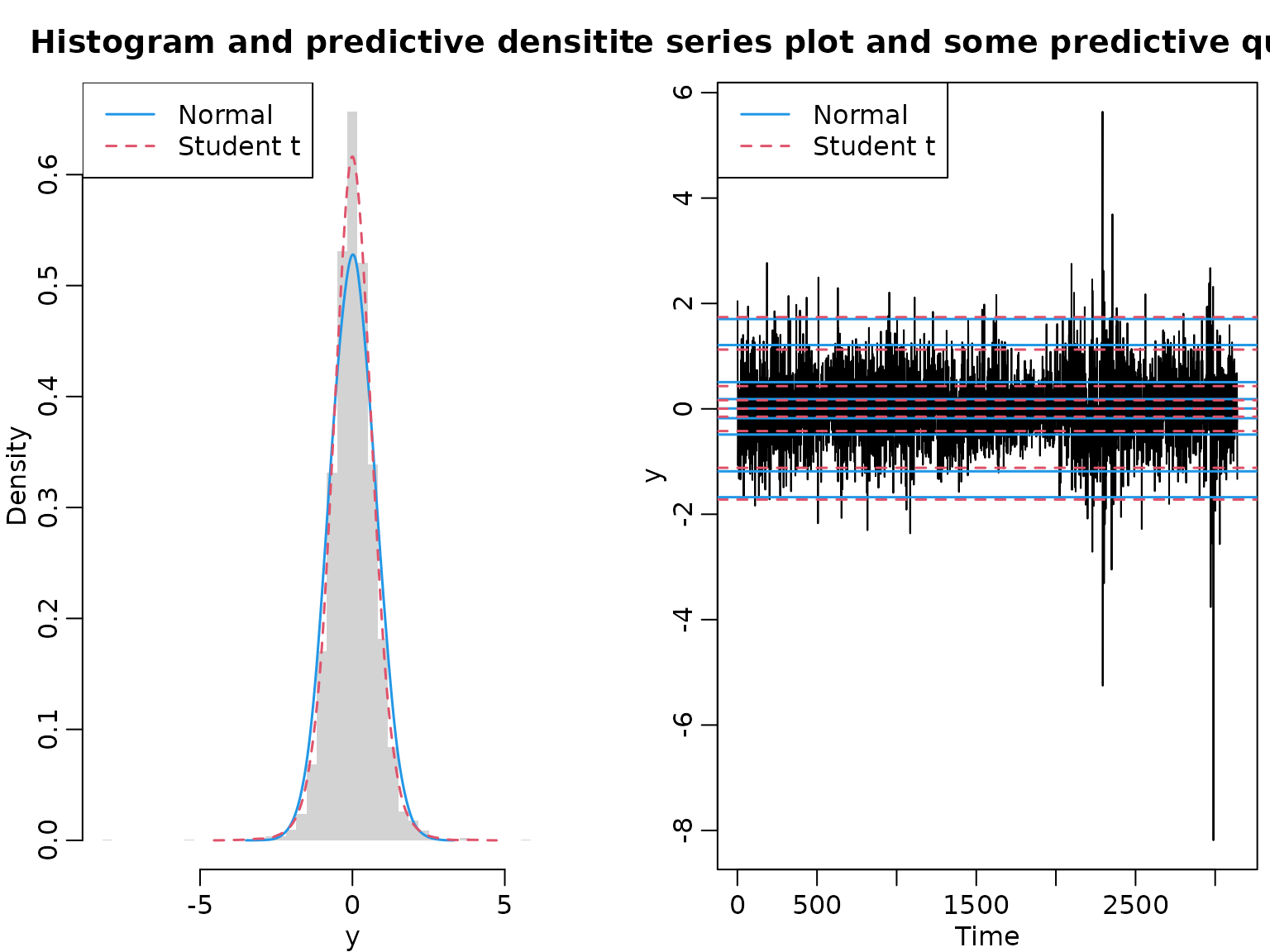
Example 9.9: Road safety data - sampling-based prediction
We use a sampling-based approach to obtain draws from the posterior predictive by first drawing from the posterior . Then, using these draws as mean parameters for the Poisson likelihood, we draw 12 times each to obtain yearly predictions. Of these, we take the maxima.
set.seed(1)
y <- accidents[, "seniors_accidents"]
aN <- sum(y) + 1
bN <- length(y)
mus <- rgamma(ndraws, aN, bN)
yfs <- matrix(rpois(12 * ndraws, mus), ncol = 12)
Us <- apply(yfs, 1, max)
probs <- c(0.025, 0.975)
quantile(Us, probs)
#>  2.5% 97.5%
#>     7    13
Now we visualize.
plot(tab <- proportions(table(Us)), xlab = "U", ylab = "")
plot(as.table(cumsum(tab)), type = "h", xlab = "U", ylab = "")
abline(h = probs, lty = 3)
mtext(probs, side = 2, at = probs, adj = c(0, 1), cex = .8, col = "dimgrey")
Example 9.11: Predicting the probability of future successes
We illustrate the variance of the purely sampling-based estimator versus the Rao-Blackwellized version by running several experiments.
set.seed(42)

a0 <- 1
b0 <- 1
N <- 100
SN <- 42
H <- 10
M <- 100
nsim <- 1000

# compute the posterior parameters
aN <- a0 + SN
bN <- b0 + N - SN
mu <- aN / bN

pk1 <- pk2 <- matrix(NA_real_, nsim, H + 1)
colnames(pk1) <- colnames(pk2) <- 0:10

for (i in seq_len(nsim)) {
  # purely sampling-based
  thetas <- rbeta(M, aN, bN)
  Sfs <- rbinom(M, H, thetas)
  pk1[i, ] <- proportions(tabulate(Sfs + 1, nbins = 11)) # tabulate starts at 1

  # Rao-Blackwellized
  for (k in 0:H) {
    pk2[i, k + 1] <- mean(dbinom(k, H, thetas))
  }
}
To compute the exact probabilities, we need the density function of the beta-binomial distribution (which is not part of base R).
dbetabinom <- function(x, n, a, b, log = FALSE) {
  logdens <- lchoose(n, x) + lbeta(x + a, n - x + b) - lbeta(a, b)
  if (log) logdens else exp(logdens)
}
Now we can easily evaluate the probabilities.
pk3 <- dbetabinom(0:H, H, aN, bN)To conclude, we visualize.
boxplot(pk1, xlab = "k", range = 0, main = "Purely sampling-based")
points(pk3, col = 3, cex = 1.5, pch = 16)

boxplot(pk2, xlab = "k", range = 0, main = "Rao-Blackwellized",
        ylim = range(pk1))
points(pk3, col = 3, cex = 1.5, pch = 16)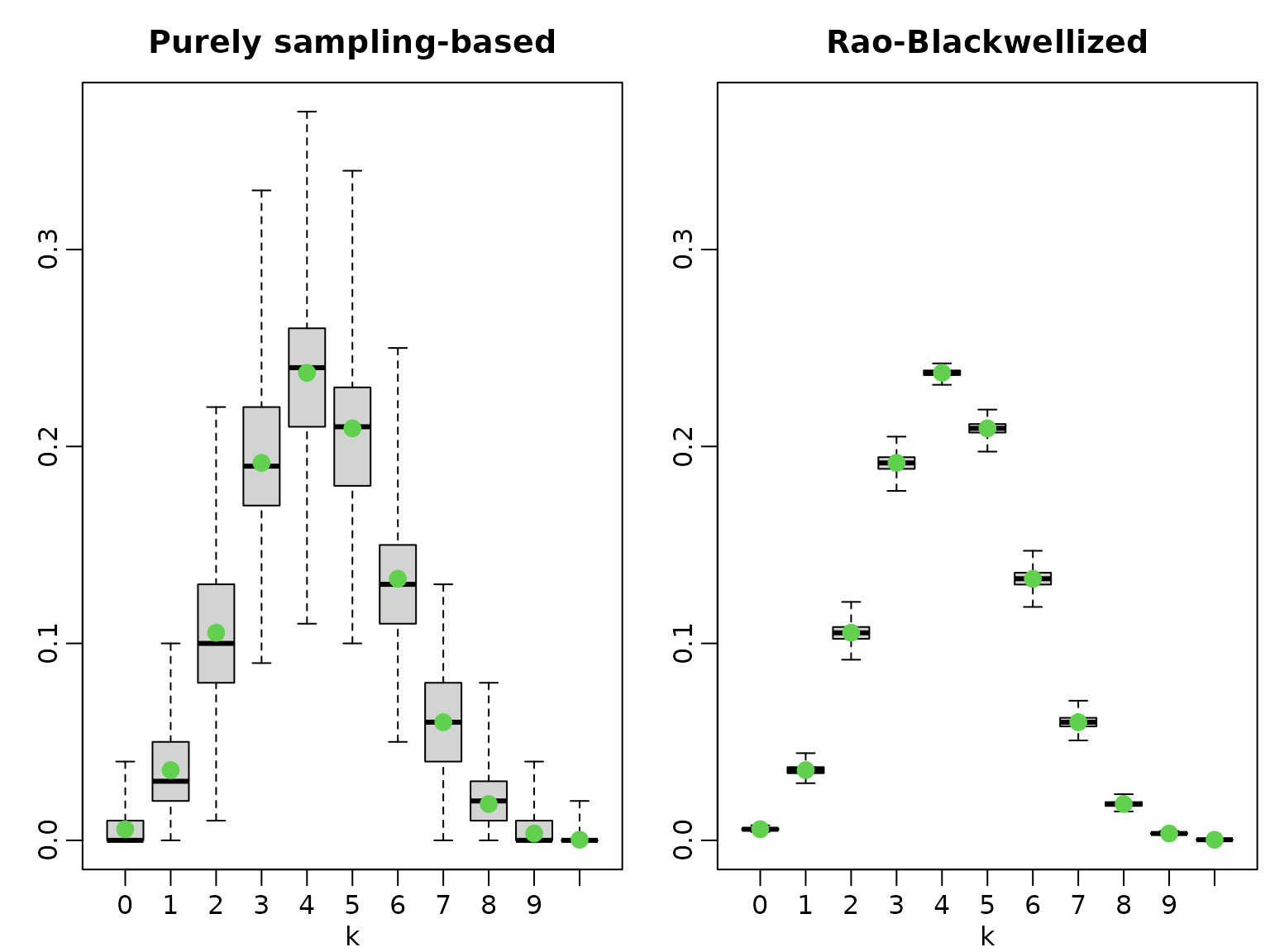
Section 9.4 Posterior Predictive Distributions in Regression Analysis
Example 9.12: Road Safety Data; potential outcome analysis
We are now interested in predicting the number of children who would have been killed or seriously injured without the legal intervention on October 1, 1994. To do so we reuse functions defined in Example 8.8.
gen.proposal.poisson <- function(y, X, e, b0 = 0, B0 = 100, t.max = 20) {
  N <- length(y)
  d <- ncol(X)

  betas <- matrix(NA_real_, ncol = t.max, nrow = d)
  beta.new <- matrix(c(log(mean(y/e)), rep(0, d - 1)), nrow = d)

  B0.inv <- solve(B0)
  for (t in seq_len(t.max)) {
    beta.old <- beta.new

    rate <- e * exp(X %*% beta.old)
    score <- t(crossprod(y - rate, X) - t(beta.old - b0) %*% B0.inv)

    H <- -B0.inv
    for (i in seq_len(N)) {
      H <- H - rate[i] * tcrossprod(X[i, ])
    }
    beta.new <- beta.old - solve(H, score)
  }
  qmean <- beta.new

  # Determine the variance matrix
  rate <- e * exp(X %*% qmean)
  H <- -B0.inv
  for (i in seq_len(N)) {
    H <- H - rate[i] * tcrossprod(X[i, ])
  }
  qvar <- -solve(H)
  return(parms.proposal = list(mean = qmean,
                               var = qvar))
}

sample_beta<- function(y,X,e, b0, B0, qmean, qvar, beta.old){

  beta.proposed <- as.vector(mvtnorm::rmvnorm(1, mean = qmean, sigma = qvar))

  # Compute log proposal density at proposed and old value
  lq_proposed <- mvtnorm::dmvnorm(beta.proposed, mean = qmean, sigma = qvar,
                                  log = TRUE)
  lq_old  <- mvtnorm::dmvnorm(beta.old, mean = qmean, sigma = qvar,
                              log = TRUE)

  # Compute log prior  of proposed and old value
  lpri_proposed <- mvtnorm::dmvnorm(beta.proposed, mean = b0, sigma = B0,
                                    log = TRUE)
  lpri_old  <- mvtnorm::dmvnorm(beta.old,  mean = b0, sigma = B0,
                                log = TRUE)
  # Compute log likelihood of proposed and old value
  lh_proposed <- dpois(y, e * exp(X %*% beta.proposed), log = TRUE)
  lh_old  <- dpois(y, e * exp(X %*% beta.old), log = TRUE)

  maxlik <- max(lh_old, lh_proposed)
  ll <- sum(lh_proposed - maxlik) - sum(lh_old - maxlik)

  # Compute acceptance probability and accept or not
  log_acc <- min(0, ll + lpri_proposed - lpri_old + lq_old - lq_proposed)

  if (log(runif(1)) < log_acc) {
    beta <- beta.proposed
    acc  <- 1
  } else {
    beta <- beta.old
    acc  <- 0
  }
  return(res = list(beta = beta, acc = acc))
}

poisson <- function(y, X, e, b0 = 0, B0 = 100, burnin = 1000L, M = 10000L) {
  d <- ncol(X)

  b0 <- rep(b0, length.out = d)
  B0 <- diag(rep(B0, length.out = d), nrow = d)

  beta.post <- matrix(ncol = d, nrow = M)
  colnames(beta.post) <- colnames(X)
  acc <- numeric(length = M)

  parms.proposal<- gen.proposal.poisson(y, X, e, b0 , B0)
  qmean <- parms.proposal$mean
  qvar<-parms.proposal$var

  beta <- as.vector(mvtnorm::rmvnorm(1, mean = qmean, sigma = qvar))

  for (m in seq_len(burnin + M)) {
    beta.draw <- sample_beta(y,X,e, b0, B0, qmean, qvar,beta)
    beta<- beta.draw$beta

    # Store the beta draws
    if (m > burnin) {
      beta.post[m - burnin, ] <- beta
      acc[m - burnin] <- beta.draw $acc
    }
  }
  return(list(beta.post = beta.post, accept = mean(acc)))
}
Our goal is to predict the number of killed or seriously injured children from October 1994 onward (i.e., when the legal intervention giving priority to pedestrians became effective) using only data before that time point. Hence we estimate the model in Example 8.8. with an intercept and a holiday effect using only the information up to September 1994.
data("accidents", package = "BayesianLearningCode")
y <- window(accidents[, "children_accidents"], end = c(1994, 9))
e <- window(accidents[, "children_exposure"],  end = c(1994, 9))
t <- length(y)

X <- cbind(intercept = rep(1, length(y)),
           holiday = rep(rep(c(0, 1, 0), c(6, 2, 4)), length.out = t))
M <- 10000
set.seed(1)
res <- poisson(y, X, e, b0 = 0, B0 = 100, M = M)
We define the covariates for the time points from October 1994 on and use the draws from the posterior distribution to predict the values of the time series.
e.pred <- window(accidents[, "children_exposure"], start = c(1994, 10))
t.pred <- length(e.pred)
X.pred <- cbind(intercept = rep(1, t.pred),
                holiday = c(rep(0, 3), rep(rep(c(0, 1, 0), c(6, 2, 4)),
                                           length.out = t.pred - 3)))

lambda <- matrix(e.pred, ncol = M, nrow = t.pred) * exp(X.pred %*% t(res$beta.post))

set.seed(2)
pred <- matrix(rpois(M * t.pred, lambda), ncol = M, nrow = t.pred)
We reuse also the function to determine mean and quantiles of the draws.
res.mcmc <- function(x, lower = 0.025, upper = 0.975) {
  res <- c(quantile(x, lower), mean(x), quantile(x, upper))
  names(res) <- c(paste0(lower * 100, "%"), "Posterior mean",
                  paste0(upper * 100, "%"))
  res
}
pred.int <- t(round(apply(pred, 1, res.mcmc), 3))
Then we plot the predictive mean together with the (equal-tailed) 95% prediction intervals.
plot(time(accidents), accidents[, "children_accidents"], type = "p", ylim = c(0, 7),
     xlab = "", ylab = "",
     main = "Number of children killed or seriously injured")
matplot(as.vector(time(e.pred)), pred.int, col = "blue", type = "l",
        lty = c(2, 1, 2), lwd = 2, add = TRUE)
abline(v = 1994.75, col = "red")
We see that the prediction intervals after the intervention are much too wide which again indicates that there is an intervention effect. Note that whereas the risk for a child to be killed or seriously injured in this model is constant the predicted mean number of killed and seriously injured children decreases from 1994 due to the decreasing number of exposures in that time period.
Section 9.5: Bayesian Forecasting of Time Series
Example 9.13: US GDP data - one-step-ahead forecasting
For creating the design matrix for an AR model, we re-use the function from Chapter 7.
ARdesignmatrix <- function(dat, p = 1) {
d <- p + 1
N <- length(dat) - p
Xy <- matrix(NA_real_, N, d)
Xy[, 1] <- 1
for (i in seq_len(p)) {
Xy[, i + 1] <- dat[(p + 1 - i) : (length(dat) - i)]
}
Xy
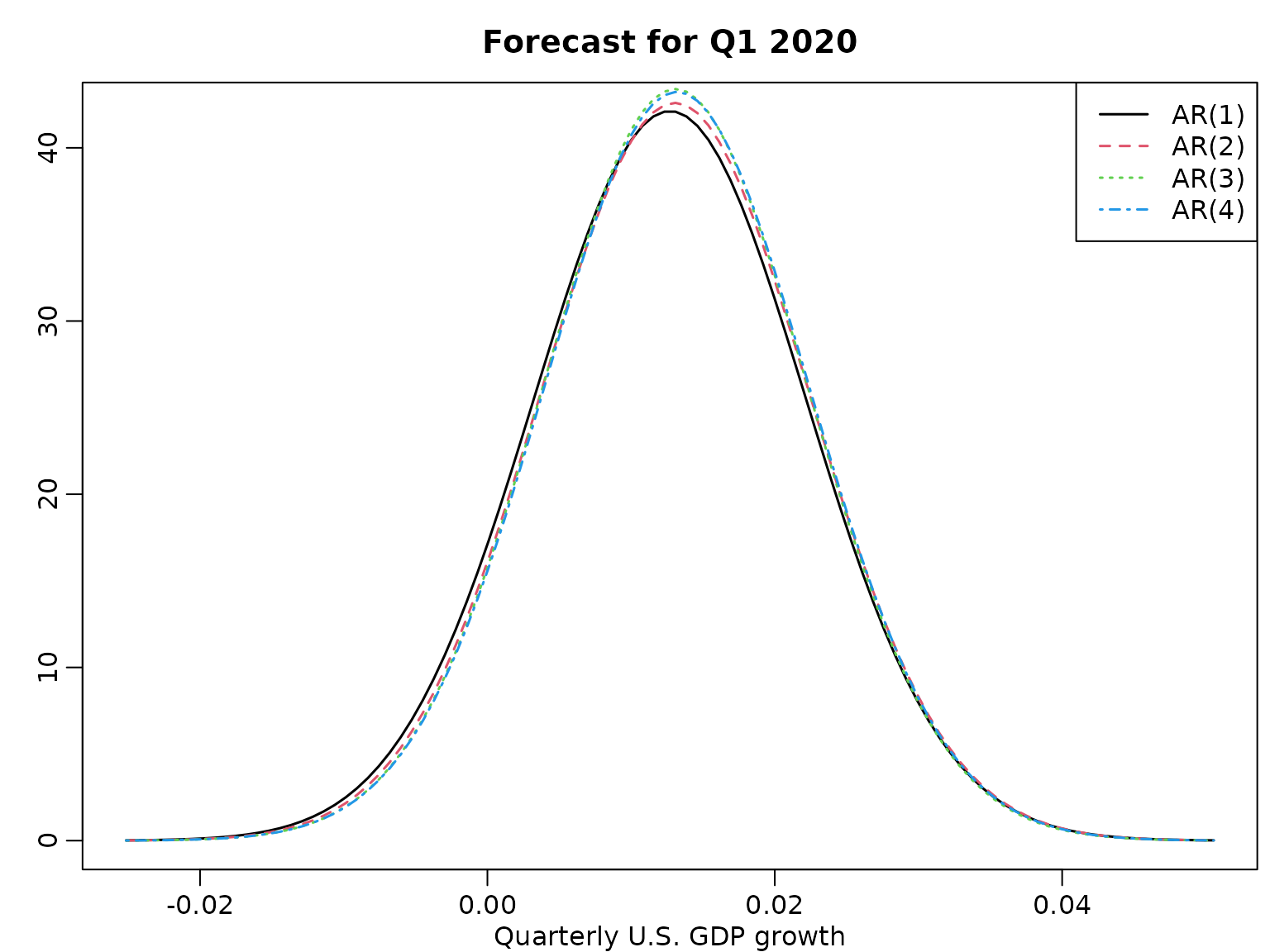
}We compute the one-step-ahead posterior predictive for various AR() models under the improper prior.
data("gdp", package = "BayesianLearningCode")
dat <- gdp[1:which(names(gdp) == "2019-10-01")]
logret <- diff(log(dat))

means <- scales <- dfs <- rep(NA_real_, 4)
for (p in 1:4) {
  y <- tail(logret, -p)
  X <- ARdesignmatrix(logret, p)

  N <- nrow(X)
  d <- ncol(X)

  BN <- solve(crossprod(X))
  bN <- tcrossprod(BN, X) %*% y
  SSR <- sum((y - X %*% bN)^2)
  cN <- (N - d) / 2
  CN <- SSR / 2

  xf <- c(1, rev(tail(y, p)))

  means[p] <- xf %*% bN
  scales[p] <- sqrt((crossprod(xf, BN) %*% xf + 1) * CN / cN)
  dfs[p] <- 2 * cN
}
And we visualize.
grid <- seq(min(means - 4 * scales), max(means + 4 * scales), length.out = 100)
plot(grid, dstudt(grid, means[1], scales[1], dfs[1]), type = "l",
     ylab = "", xlab = "Quarterly U.S. GDP growth", lwd = 1.5)
title("Forecast for Q1 2020")
legend("topright", paste0("AR(", 1:4, ")"), lty = 1:4, col = 1:4, lwd = 1.5)
for (p in 2:4) {
  lines(grid, dstudt(grid, means[p], scales[p], dfs[p]), col = p, lty = p,
        lwd = 1.5)
}
Example 9.15: US GDP data - multi-step forecasting
Now, we want to “sample the future” up to 12 steps ahead for .
M <- 10000
set.seed(1)
y <- tail(logret, -2)
X <- ARdesignmatrix(logret, 2)

N <- nrow(X)
d <- ncol(X)

BN <- solve(crossprod(X))
bN <- tcrossprod(BN, X) %*% y
SSR <- sum((y - X %*% bN)^2)
cN <- (N - d) / 2
CN <- SSR / 2

sigma2s <- rinvgamma(M, cN, CN)
betas <- matrix(NA_real_, M, 3)
for (i in seq_len(M)) betas[i, ] <- mvtnorm::rmvnorm(1, bN, sigma2s[i] * BN)

zetas <- betas[, 1]
phi1s <- betas[, 2]
phi2s <- betas[, 3]
sigmas <- sqrt(sigma2s)
yfs <- matrix(NA_real_, M, 8)

yfs[, 1] <- rnorm(M, zetas + phi1s * y[length(y)] +
                  phi2s * y[length(y) - 1], sigmas)

yfs[, 2] <- rnorm(M, zetas + phi1s * yfs[, 1] +
                  phi2s * y[length(y)], sigmas)

for (h in 3:8) {
  yfs[, h] <- rnorm(M, zetas + phi1s * yfs[, h - 1] + phi2s * yfs[, h - 2],
                    sigmas)
}
And we visualize. First, we plot four randomly selected paths.
horizon <- 8
ats <- seq(1, 3 * horizon)
past <- as.numeric(substring(gsub("-.*", "", tail(names(y), 2 * horizon)), 3))
years <- c(past, tail(past, 1) + rep(1:(horizon / 4), each = 4))
labs <- paste0(years, "Q", 1:4)
these <- sort(sample.int(M, 4))
for (i in 1:4) {
  plot(tail(y, 2 * horizon), main = paste("m =", these[i]),  type = "l",
       xlim = c(1, 3 * horizon), ylim = range(tail(y, 2 * horizon), yfs[these, ]),
       ylab = "", xlab = "Quarter", lwd = 1.5, xaxt = "n")
  axis(side = 1, at = ats, labels = labs[ats])
  lines((2 * horizon):(3 * horizon), c(tail(y, 1), yfs[i, ]), lty = 2, lwd = 1.5)
  abline(v = 2 * horizon, lty = 3)
  abline(h = 0, lty = 3)
}
And now we plot the predictions.
par(mfrow = c(1, 1))
plot(tail(y, 2 * horizon), type = "l", xlim = c(1, 3 * horizon), lwd = 1.5,
     ylim = range(quants), ylab = "U.S. GDP growth", xlab = "Quarter",
     xaxt = "n", main = "Historical time series and predictive intervals")
axis(side = 1, at = ats, labels = labs[ats])
xs <- (2 * horizon + 1):(3 * horizon)
lines(xs, quants["50%", ], lwd = 1.5, col = 2, lty = 2)
pxs <- c(xs[1], xs, rev(xs))
polygon(pxs, c(quants["25%", 1], quants["75%", ], rev(quants["25%", ])),
        col = rgb(1, 0, 0, .2), border = NA)
polygon(pxs, c(quants["10%", 1], quants["90%", ], rev(quants["10%", ])),
        col = rgb(1, 0, 0, .2), border = NA)
polygon(pxs, c(quants["5%", 1], quants["95%", ], rev(quants["5%", ])),
        col = rgb(1, 0, 0, .2), border = NA)
abline(h = 0, lty = 3)
Example 9.16: US GDP data - forecasting non-linear functionals
Let us compute the probability of seeing negative growth rates a least once in eight quarters. Not that this is highly nonlinear.
Example 9.17: US GDP data - forecasting the level
Another example of a nonlinear function of the predicted log returns is the level, which, given our simulation-based approach, is easy to compute.
We visualize.
par(mfrow = c(1, 1))
plot(tail(gdp, 2 * horizon), type = "l", xlim = c(1, 3 * horizon),
     ylim = range(quants, tail(gdp, 2 * horizon)), ylab = "U.S. GDP",
     xlab = "Quarter", lwd = 1.5, xaxt = "n",
     main = "Historical time series and predictive intervals")
axis(side = 1, at = ats, labels = labs[ats])
xs <- (2 * horizon + 1):(3 * horizon)
lines(xs, quants["50%", ], lwd = 1.5, col = 2, lty = 2)
pxs <- c(xs[1], xs, rev(xs))
polygon(pxs, c(quants["25%", 1], quants["75%", ], rev(quants["25%", ])),
        col = rgb(1, 0, 0, .2), border = NA)
polygon(pxs, c(quants["10%", 1], quants["90%", ], rev(quants["10%", ])),
        col = rgb(1, 0, 0, .2), border = NA)
polygon(pxs, c(quants["5%", 1], quants["95%", ], rev(quants["5%", ])),
        col = rgb(1, 0, 0, .2), border = NA)
abline(h = 0, lty = 3)
Section 10.5.3: Forecasting Volatility via GARCH(1,1) Models
We start by defining the parameter transformation.
unrestricted2restricted <- function(theta) {
  alpha0 <- exp(theta[1])
  exptheta2 <- exp(theta[2])
  exptheta3 <- exp(theta[3])
  denom <- 1 + exptheta2 + exptheta3
  alpha1 <- exptheta2 / denom
  gamma1  <- exptheta3 / denom
  c(alpha0, alpha1, gamma1)
}
Next, we define the log likelihood function and the log posterior.
loglik <- function(y, theta) {
  pars <- unrestricted2restricted(theta)
  sigma2 <- rep(NA_real_, length(y))

   # Initialize at unconditional variance
  sigma2[1] <- pars[1] / (1 - pars[2] - pars[3])
  for (i in 2:length(y)) {
    sigma2[i] <- pars[1] + pars[2] * y[i - 1]^2 + pars[3] * sigma2[i - 1]
  }

  loglik <- -0.5 * log(2 * pi) * length(y) - sum(log(sigma2) + y^2 / sigma2)

  # To return sigma2 as a by-product, we "attach" it to the loglik value
  attr(loglik, "sigma2") <- sigma2
  loglik
}

logprior <- function(theta, priormeans = rep(0, 3), priorsds = rep(10, 3)) {
  dnorm(theta[1], priormeans[1], priorsds[1], log = TRUE) +
    dnorm(theta[2], priormeans[2], priorsds[2], log = TRUE) +
    dnorm(theta[3], priormeans[3], priorsds[3], log = TRUE)
}
Finally, we define our random walk MH posterior sampler.
sampler <- function(y, M = 20000L, nburn = 2000L, propsds = rep(0.1, 3),
                    startvaltheta = rep(0, 3)) {
  # Allocate storage
  thetas <- matrix(NA_real_, M, 3)
  sigma2s <- matrix(NA_real_, M, length(y))

  # Starting values
  theta <- startvaltheta
  currentlogpost <- loglik(y, theta) + logprior(theta)

  naccepts <- 0L
  for (m in seq_len(nburn + M)) {
    prop <- rnorm(3, theta, propsds)
    proplogpost <- loglik(y, prop) + logprior(prop)
    logR <- proplogpost - currentlogpost

    # Accept / reject
    if (log(runif(1)) < logR) {
      theta <- prop
      currentlogpost <- proplogpost
      if (m > nburn) naccepts <- naccepts + 1L
    }

    # Store
    if (m > nburn) {
      thetas[m - nburn, ] <- theta
      sigma2s[m - nburn, ] <- attr(currentlogpost, "sigma2")
    }
  }

  # Transform back to the usual parameterization
  paras <- t(apply(thetas, 1, unrestricted2restricted))
  colnames(paras) <- c("alpha0", "alpha1", "gamma1")
  ret <- list(para = as.data.frame(paras), sigma2 = sigma2s,
              theta = as.data.frame(thetas), y = y,
              ndraws = M, nburn = nburn, acceptrate = naccepts / M)
  ret
}
We are now ready to apply the sampler to our USD-CHF exchange rate percentage log returns.
data("exrates", package = "stochvol")
y <- 100 * diff(log(exrates$USD / exrates$CHF))

# Run the sampler
res <- sampler(y)

# Visually check convergence
plot.ts(res$theta, main = paste("Acceptance Rate:", round(res$acceptrate, 2)))

Let us visualize the parameters and the posterior mean of the conditional standard deviations (along with the data).
myhist <- function(dat, breaks = 30, freq = FALSE, ...) {
  hist(dat, breaks = seq(min(dat), max(dat), length.out = breaks), freq = freq,
       main = "", ylab = "", ...)
}

ts.plot(y, col = "gray", ylab = "")
lines(colMeans(sqrt(res$sigma2)))
legend("topright", legend = c("Log returns", bquote(E(sigma[t] ~ "|" ~  bold(y)))),
       lty = 1, col = c("gray", 1))
myhist(res$para$alpha0, xlab = expression(alpha[0]))
myhist(res$para$alpha1, xlab = expression(alpha[1]))
myhist(res$para$gamma1, xlab = expression(gamma[1]))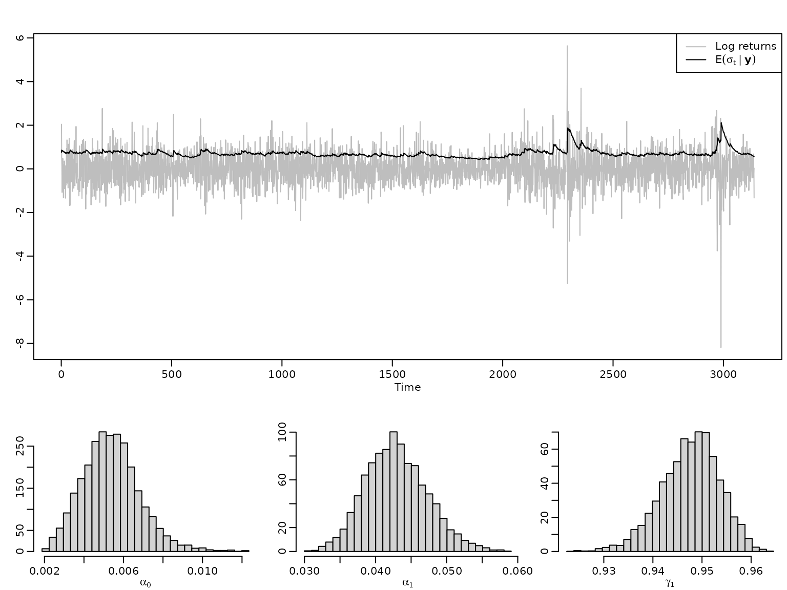
We now turn towards prediction, which can be done iteratively. We define a function that predicts a number of steps ahead.
prediction <- function(obj, nahead = 1L, drawsmult = 1L) {
  # Allocate storage space
  sigma2f <- yf <- matrix(NA_real_, obj$ndraws * drawsmult, nahead)

  # Predict one step ahead
  sigma2f[, 1] <- rep(obj$para$alpha0 + obj$para$alpha1 * tail(obj$y, 1)^2 +
    obj$para$gamma1 * obj$sigma2[, ncol(obj$sigma2)], drawsmult)
  yf[, 1] <- rnorm(obj$ndraws * drawsmult, 0, sqrt(sigma2f[, 1]))

  # Predict two and more steps ahead
  if (nahead > 1L) {
    for (i in 2:nahead) {
      sigma2f[, i] <- obj$para$alpha0 + obj$para$alpha1 * yf[, i - 1]^2 +
        obj$para$gamma1 * sigma2f[, i - 1]
      yf[, i] <- rnorm(obj$ndraws * drawsmult, 0, sqrt(sigma2f[, i]))
    }
  }

  # Return
  list(y = yf, sigma2 = sigma2f)
}
Let’s try it out. We cut the data a some point, re-estimate and predict.
cutoff <- 2990
nahead <- 50
ytrain <- head(y, cutoff)
restrain <- sampler(ytrain)

# Visually check convergence
plot.ts(restrain$theta, main = paste("Acceptance Rate:", round(restrain$acceptrate, 2)))

predstatic <- prediction(restrain, nahead, drawsmult = 10)
predstaticquants <- apply(predstatic$y, 2, quantile, thesequants)
Alternatively, we might want to do sequential one-step-ahead predictions. Note that this amounts to re-estimating the model very often, thus we reduce the number of posterior draws and the burn-in. To speed up convergence, we initialize the sampler at the posterior means from above.
predquants <- matrix(NA_real_, nrow = length(thesequants), nahead)
predsigmamean <- rep(NA_real_, nahead)
longrunsdmean <- rep(NA_real_, nahead)
for (i in seq_len(nahead)) {
  y1 <- head(y, cutoff - 1 + i)
  res1 <- sampler(y1, M = 2000, nburn = 200,
                  startvaltheta = colMeans(restrain$theta))
  longrunsdmean[i] <- mean(sqrt(res1$para$alpha0 /
                                   (1 - res1$para$alpha1 - res1$para$gamma1)))
  pred1 <- prediction(res1, 1, drawsmult = 100)
  predsigmamean[i] <- mean(sqrt(pred1$sigma2[, 1]))
  predquants[, i] <- quantile(pred1$y[, 1], thesequants)
}
And visualize.
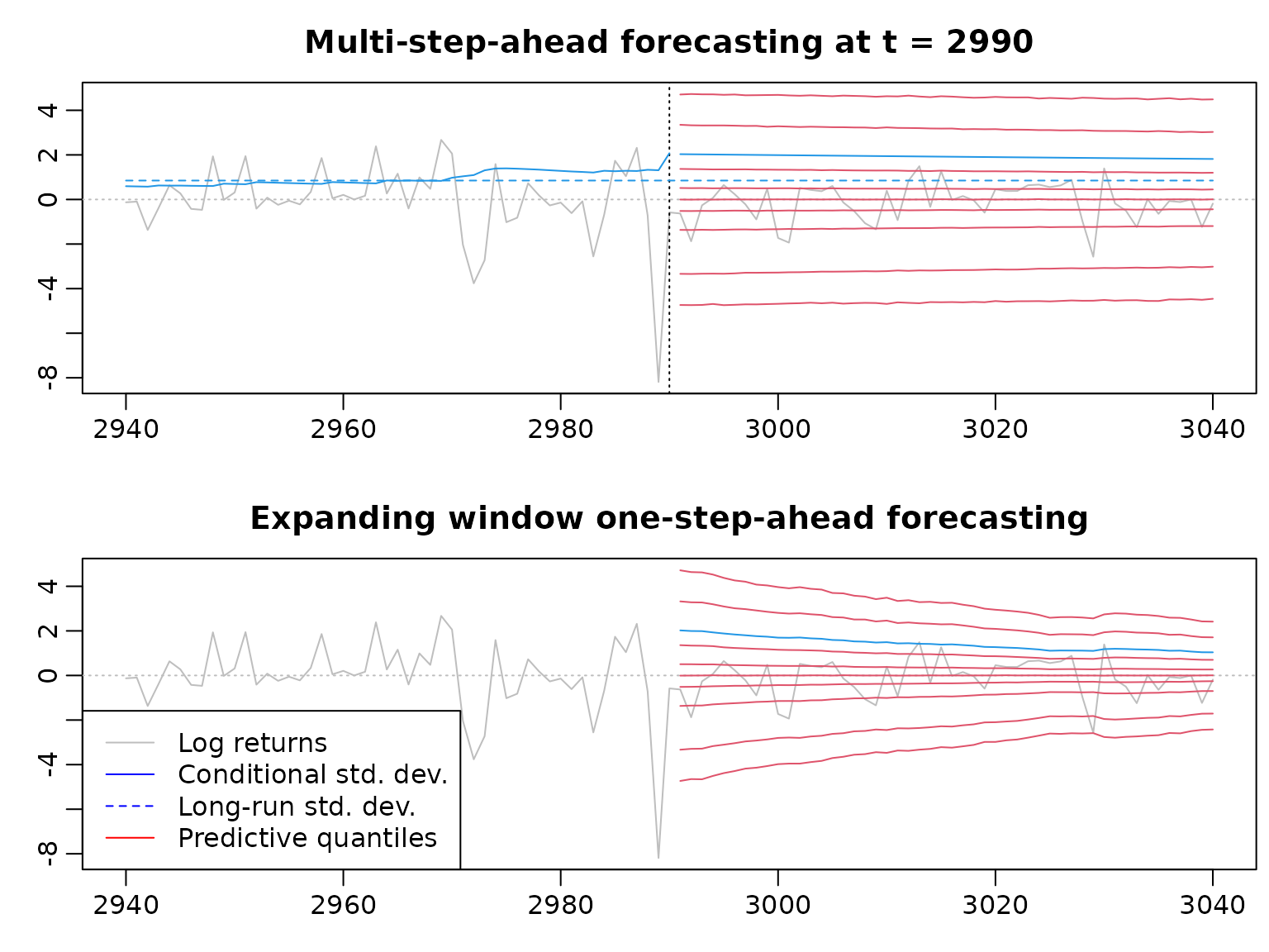
plotwindow <- (cutoff - nahead):(cutoff + nahead)
pastwindow <- (cutoff - nahead):cutoff
predwindow <- cutoff + 1:nahead
plot(plotwindow, y[plotwindow], xlab = "", ylab = "", col = "gray", type = "l",
     main = "Multi-step-ahead forecasting at t = 2990",
     ylim = range(predstaticquants, y[plotwindow]))
abline(h = 0, lty = 3, col = "gray")
abline(v = cutoff, lty = 3)
lines(pastwindow, colMeans(sqrt(restrain$sigma2[, pastwindow])), col = 4)
lines(predwindow, colMeans(sqrt(predstatic$sigma2)), col = 4)
lines(plotwindow[c(1, length(plotwindow))],
      rep(mean(sqrt(restrain$para$alpha0 / (1 - restrain$para$alpha1 -
                                              restrain$para$gamma1))), 2),
      lty = 2, col = 4)
for (i in seq_along(thesequants)) {
  lines(predwindow, predstaticquants[i, ], col = 2)
}

plot(plotwindow, y[plotwindow], xlab = "", ylab = "", col = "gray", type = "l",
     main = "Expanding window one-step-ahead forecasting",
     ylim = range(predstaticquants, y[plotwindow]))
abline(h = 0, lty = 3, col = "gray")
lines(predwindow, predsigmamean, col = 4)
for (i in seq_along(thesequants)) {
  lines(cutoff + 1:nahead, predquants[i, ], col = 2)
}
legend("bottomleft", legend = c("Log returns", "Conditional std. dev.",
                                "Long-run std. dev.", "Predictive quantiles"),
       col = c("gray", "blue", "blue", "red"), lty = c(1, 1, 2, 1))